
Arts and Architecture
(Product Design)
A tool for curatorship and collaboration, helping architects organize and present tailored ideas based on their clients’ input. It’s not just about offering options—it’s about guiding clients on a journey of discovery, bridging professional expertise with personal vision, and fostering meaningful collaboration for designs built on shared understanding
Project Type
App creation for the Magazine, Arts and Architecture
Software
Figma
My Role
UI/UX Designer
Team
Ella Dubey, Sanjana Joshi
Duration
3 weeks
+ Research
Arts & Architecture was an influential American magazine covering design, architecture, landscape, and the arts. It was founded in 1929, and became an epicenter of modernist culture during its peak in the 1940s, 50s, and early 60s under the visionary leadership of John Entenza.
Entenza transformed Southern California into a global hub for modernism, using the magazine to redefine how architecture could shape an ideal lifestyle The magazine’s pages didn’t just present beautiful homes—they sold a vision of "ideal" living that resonated deeply with Americans and ultimately inspired the world

+ Book Contents
This content covers architecture, art, and design, highlighting groundbreaking projects and visionary ideas. Known for promoting movements like the Case Study Houses, the magazine inspires architects and artists through insightful essays and striking visuals that have influenced modern aesthetics.


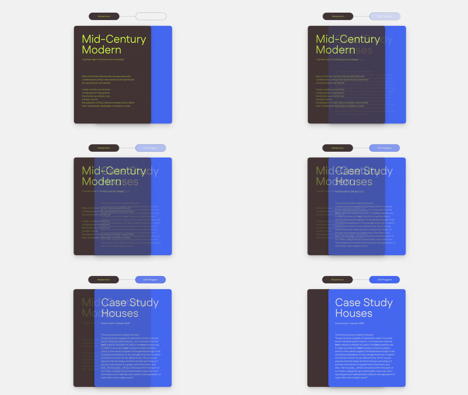
Modernism & Case Study House Program
-
Promoted mid-century modern design.
-
Emphasized clean lines and functionality.
-
Featured the Case Study House program.
-
Integrated nature into design concepts.
-
Inspired architects and designers.
-
Cemented a lasting design legacy.
-
Experimental homes showcasing modern design.
-
Focused on functionality and simplicity.
-
Utilized new materials and technologies.
-
Designed for affordable, modern living.
-
Influenced mid-century modern architecture.
+ Objective
Project Brief: Conduct an analysis and research of the content and supplementary materials from the assigned diverse publications. Use the insights gathered to develop a strategy and prototype a functional, relevant digital application.
Goals: The goal was to create an app that is both functional and relevant, focusing on user-centered design. It was developed to offer seamless functionality while staying true to the insights gathered from the research, ensuring an engaging and valuable experience for users.

Funtional

Relevant
+ Supplementary Elements

.jpg)
Supplementary resources like Dwell magazine and Case Study Houses by Taschen offer valuable insights into mid-century modern design, which can enhance the UX design process. These publications highlight design principles such as functionality, aesthetics, and user-centered layouts, helping UX designers understand how space, form, and materials impact user experience. By analyzing these elements, designers can create more intuitive and engaging digital experiences that resonate with users.
+ User Persona
We created Sarah and Oliver as user personas to represent the different types of users the app serves. Sarah, the client, is enthusiastic but often overwhelmed by scattered inspiration, seeking guidance to create a cohesive vision. Oliver, the architect, must transform these diverse ideas into a functional design while balancing practical considerations. Their collaboration highlights the need for a tool that fosters clear communication and supports the design process.
Sarah - The Client
-12.png)
-11.png)
-10.png)
-13.png)
Oliver - The Architect
+ Journey Map
-19.png)
Curate
We’ve created a tool for curatorship and collaboration that helps architects organize and present tailored ideas based on their clients’ input. The app goes beyond offering options—it guides clients on a journey of self-discovery, bridging professional expertise with personal vision. By fostering meaningful collaboration, it helps clients uncover their true preferences and needs, moving beyond surface-level inspiration to explore curated insights and designs. The goal is to create a collaborative process that combines curation, exploration, and critical evaluation, crafting spaces that are functional, beautiful, and deeply personal, while fostering meaningful dialogue between architects and homeowners for the best possible outcome.
The app was created for three types of users:
-
Architects - A tool to curate and present tailored ideas, fostering discovery and collaboration with clients.
-
Homeowners - A tool to discover their true preferences, in order to create spaces that genuinely reflect them.
-
Both - Together, aim to create a collaborative process that combines curation, exploration, and critical evaluation. The goal is to craft spaces that are functional, beautiful, and deeply personal, fostering meaningful dialogue between architects and homeowners to achieve the best possible outcome.
Collaborative
Personalized
+ User Flow
The user begins on the home screen, choosing between education or curating their own home. Through an onboarding questionnaire, the app analyzes preferences and suggests homes. Users select homes to compare, add notes, and receive updates. Exploring a home's details reveals images, features, and architectural insights. A mood board stores inspirations, while the education section offers critiques and floorplans of iconic houses. This streamlined process helps users refine their architectural vision from scattered ideas to clear preferences.
-21.png)
+ Wireframes - Low-Fidelity
Homepage

Selected Homes

More Information

Questionnaire

Information

Educate

+ User Testing
Goal:
Test the effectiveness, clarity, and user satisfaction of recent feature updates aimed at improving navigation, personalization, and collaboration between users and architects. An additional focus during user testing was on critiquing the houses featured in the book, as many are no longer considered ideal for modern living. To address this, our main objective was to create a solution by introducing caution signs and information buttons, providing users with critical context and highlighting potential limitations of these historic designs.
Key things we were testing after feedback:
-
Is the reordered Educate section easier to understand?
-
Are the three-state checkboxes and the Compare feature working as expected?
-
Does the connected profile system make users feel more integrated with their architect and made the interaction more collaborative?
-
Does the color-coded Mood Board improve clarity in collaboration to see what is added by which user?
-
Does the messaging section between the two users help with better communication?
-
Is overall navigation simpler with the new Profile and Moodboard buttons?
Changes made:
-
Educate Section: Test if the new order (Floorplan - Critique - About) improves understanding and navigation.
-
Three-State Checkboxes: Select homes using Checked, Unchecked, and Empty options; check if selections show correctly in Compare.
-
Connected Profile System: Access and interact with the linked architect profile; test ease of communication with the messaging section.
-
Mood Board with Color Coding: Add elements and check if color coding clearly distinguishes user vs. architect selections.
-
New Buttons: Assess if navigation feels easier.
+Design System
The design system reflects the modernity of the curated homes with a clean aesthetic, simple icons, and a minimal color palette. Sleek typography and structured layouts ensure clarity, while subtle animations enhance usability. This balance of sophistication and simplicity makes the app both an inspirational and educational tool.
Colors:
HEX: #496CF7
Sky Blue
HEX: #C7EE47
Neon
HEX: #423535
Brown
HEX: #9D89FC
Lilac
HEX: #062F65
Dark Blue
Checked/Unchecked
Buttons:

Save/Unsave

Typeface:

Button Behavior:


Behavior for inital form buttons
Behavior for general buttons


Curate
+ Learning Outcomes
Modernizing the Case Study Homes was challenging, as it required balancing their mid-century design with contemporary needs. Adapting these iconic structures meant preserving their minimalist aesthetics while integrating sustainable materials, smart home technology, and flexible living spaces. Ensuring relevance for today’s users also involved refining the visual and interaction design to maintain both historical integrity and modern usability.